


https://github.com/MARVELGARR/Twitter-clone
So after years of watching tutorial videos and reading PDFs on different programming languages, I decided to stick to one and follow up with project-based learning. HTML, CSS, and JavaScript are what I chose to focus on, and right from the start, I started by creating a Twitter clone just to see if I learned anything throughout those years and hoping that I could also learn something from it. And, boy! It took me one week to complete. Not only because I was stuck in some aspects of CSS like "position: fixed", but because I did not have a good computer system. Living in a third-world country like Nigeria brings a lot of challenges, like a lack of funds and tools to aid learning for newbies getting into tech. To cut the story short, let me show you my progress and what I have learned building a Twitter homepage clone.
css layout-(grid and flexbox)
css positions and mostly “position fixed” and how it affects the layout
css unit
media query
html forms
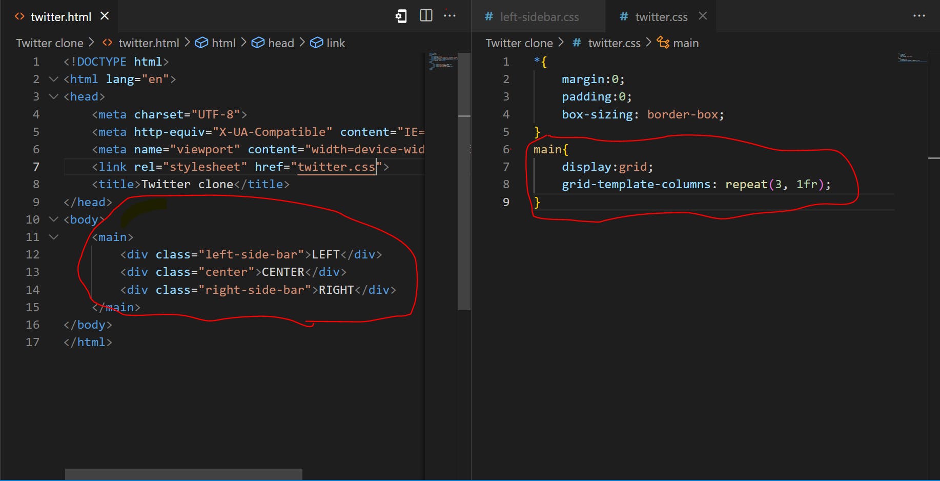
The layout
"💻 CSS Grid, here I come! I used it for the main layout because I needed those 3 equal columns to be super easy-peasy! 🙌"
"🤔 Note this: i tried using CSS Flexbox and I just don't mix. It was annoying me with its position fixed for the left-side-bar. So i switched to switch things up with CSS Grid! 💪
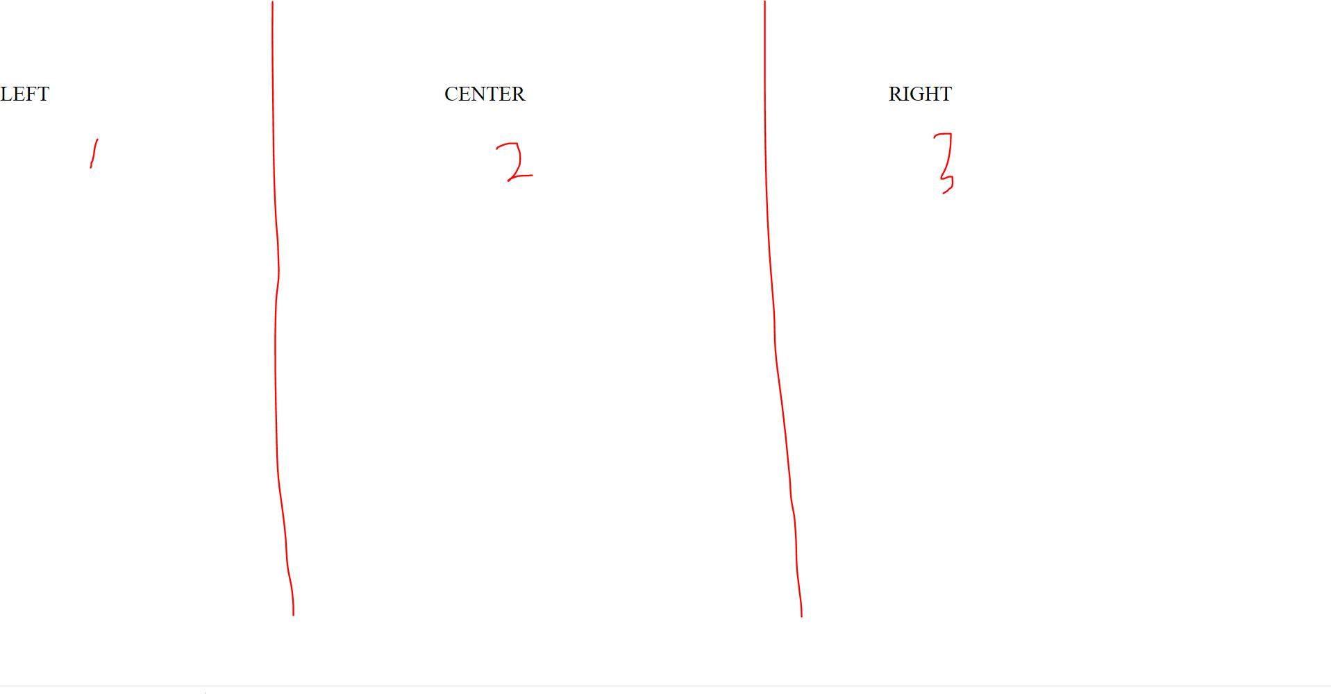
💻 I went all out and used the main tag as my parent container for my Twitter project 🤯 I was feeling fancy, so I added three containers 🛢️ to represent the three sections of the Twitter homepage 🐦. I named them the left-side-bar 🔽, center 💭, and right-side-bar 🔼, because who doesn't love a good organizational system 🤓.
I also made them of equal width by giving them a CSS rule seen below. i also center the container. because that's how i saw the Twitter homepage layout.
twitter homepage example..
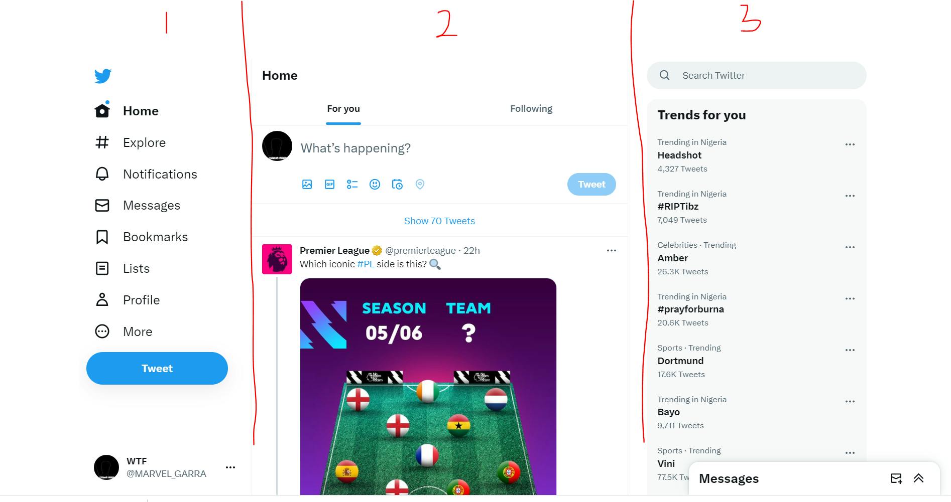
it gave me the result below🔽

👨💻 After I created the layout, I was hit with a problem that kept me occupied for two whole days 🤯 It turns out that the left side of the page wasn't supposed to be scrolling with the rest of the page 🤦♂️. So, I turned to the trusty Google search engine 🔍 and found out that I needed to use position: fixed on the side. But every time I tried it, it broke my layout 🤬 It was incredibly annoying 😤 Check out what I mean below.
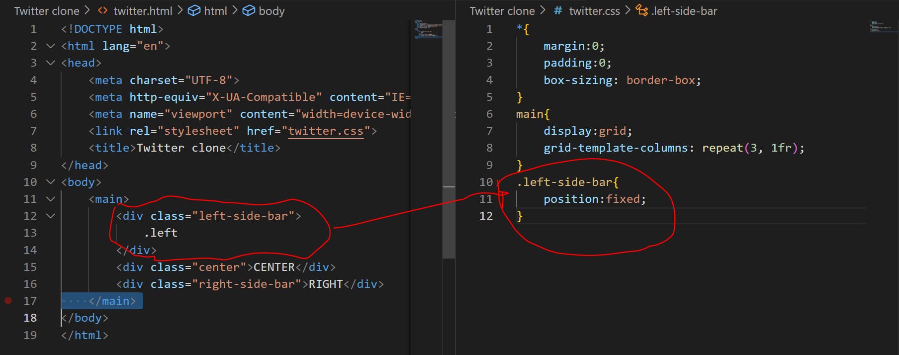
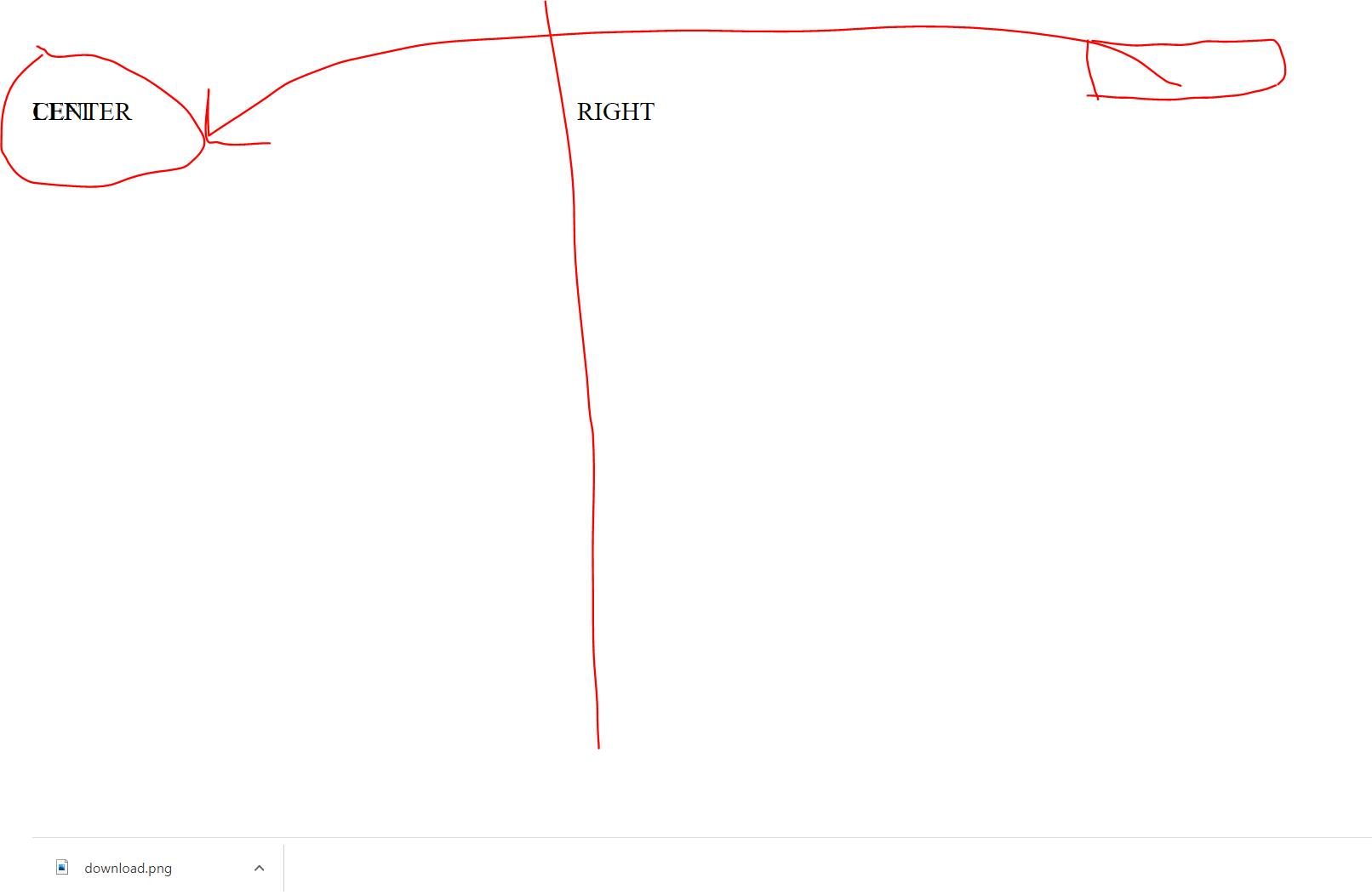
My left side was overlapping my right side, but the center remained where it was 🤔 That was super strange to me because I didn't have a clue about position: fixed 🤷♂️ I was used to position: relative and position: absolute... this was so depressing 😞 I saw other beginners in the 100 Days of Coding doing it in just 2 days and it was taking me 3 whole days just to get my layout working properly 😩 I checked out other Twitter clones from the 100 Days of Coding and they were using position: sticky, which I knew wasn't what was used there. But then, I stumbled upon a lifesaving YouTube video by Monsterlesson Academy and Kelvin Powell 🎥 They explained how position: fixed affects the parent container and it was a total game changer 🙌
I finally learned the hard way that you can't put position: fixed in the parent container because it will break the whole layout 🤯 So, I had to put it inside a child container instead 🤓. In the left-side-bar, I created another container called left-side and finally used position: fixed there. It took me days of reading about flexbox and grid layout, not realizing the root cause was the placement of position: fixed all along 😔
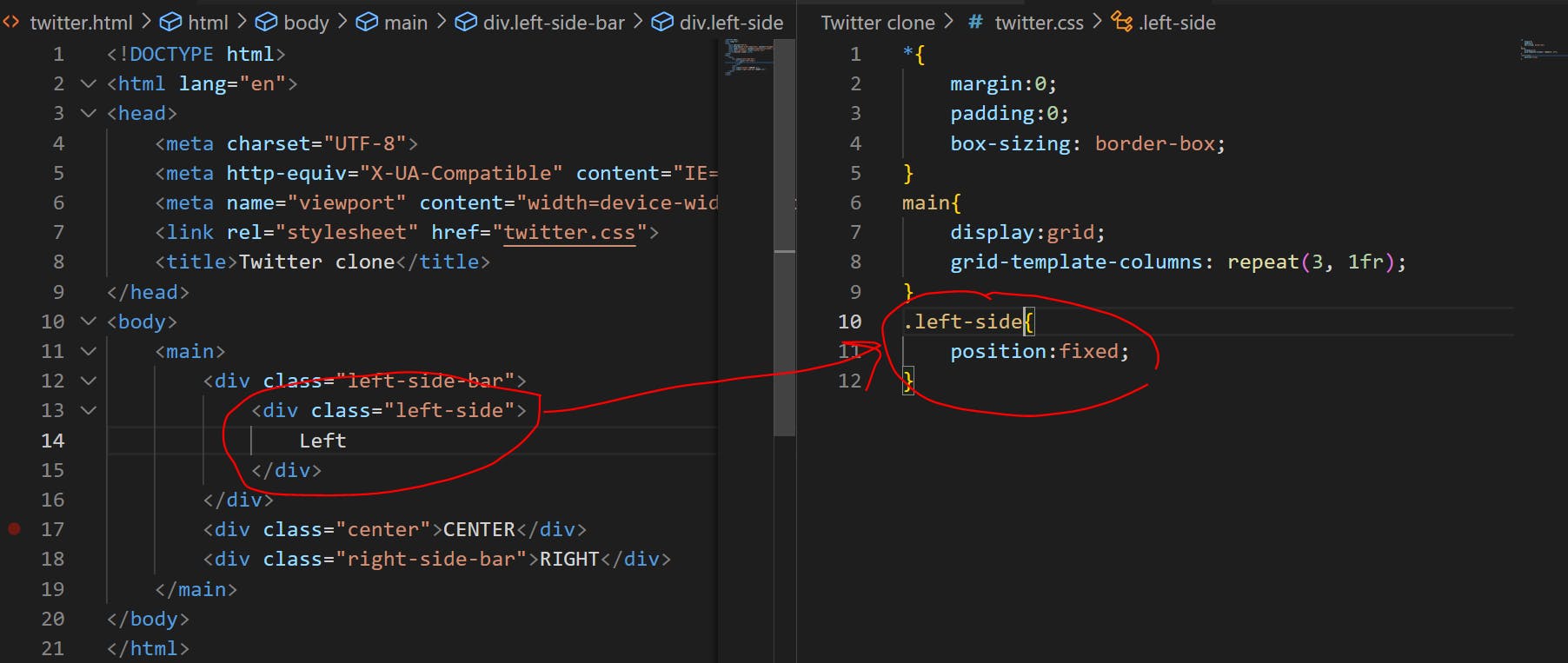
It worked like a charm.. monsterlesson on youtube save me alot of headache
css units
At first, I was using pixels for everything and it was all good until I realized that not all screens are the same size 📱 So, I started experimenting with different units like em, rem, and %.
🤓 Then, I stumbled upon the vh and vw units and it was a game changer 💥 These units are based on the viewport size and I was able to create a responsive design that looked great on all screens 📈 The best part? I learned so much by just diving into a project and trying things out for myself 💪. Who knew learning CSS could be so fun and rewarding.
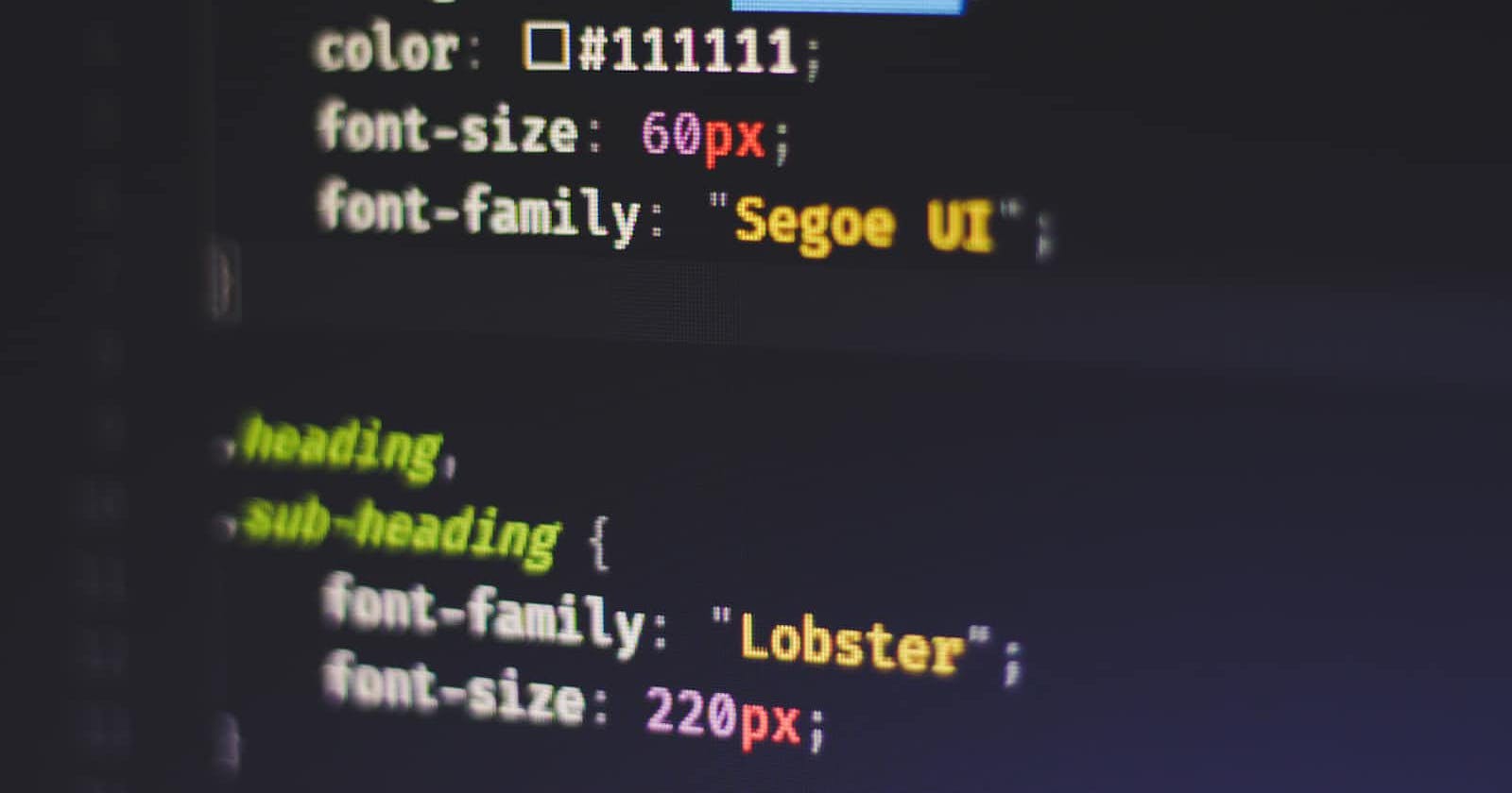
font size
I was having a tough time figuring out how to choose the right unit for my font sizes in CSS. I wanted my website to look great on all devices, but I wasn't sure how to make sure the text would be legible and appropriately sized no matter the screen size.
👀 That's when I learned about "REM" units! 💡 REM stands for "root em", which is the font size of the root element of a document (usually set to 16px).
💪 By using REMs for font size, I was able to create a scalable and responsive design with ease. I could adjust the root font size to change the font size for the entire page, and all the REM-based font sizes would automatically update accordingly.
🎨 This made it simple for me to make sure my text looked great and was legible on any device. I was so happy to have found a solution that made my life as a designer so much easier! 🙌
👍 So, if you're ever struggling with choosing the right unit for your font sizes in CSS, remember that REMs are a great choice for creating a responsive design! 💻🖥️
And that's how my journey to create a Twitter homepage clone began and ended! I wanted to boost my HTML CSS skills and what better way to do that than by building a replica of one of the most popular websites on the internet?
💻 I worked hard and learned so much, tweaking and adjusting the design to make it just right. But the best part was when I finally hit that "Publish" button and saw my creation live on the web! 🚀
Twitter clone (The live demo of the project)
😆 There were definitely some humorous moments along the way, like when I tried to copy and paste the hope page source code of Twitter and ended up making it spin look stupid. But every mistake was a lesson and I learned so much from each one.
📝 And now, I'm excited to continue documenting my journey and sharing my experiences with others. Who knows what other website clones I'll tackle next? But one thing's for sure, I'll continue to use humor and the right emoji to make it an entertaining ride! 🚀💻💡