Building Your First Responsive Multi-Step Form with HTML, CSS, and JavaScript: A Beginner's Guide to Frontend Development -A Frontend Mentor Challenge


Check the code @https://github.com/MARVELGARR/Multi-step-form
veiw the demo @ https://storied-centaur-e8b562.netlify.app
👋 Hey there, folks! It's your boy Marvellous Obatale, a beginner frontend dev who's learning the ropes and trying not to pull my hair out 😅.
🙄 So, who loves filling out forms? Anyone? Bueller? Yeah, didn't think so. But fear not, because I've got a trick up my sleeve to make it less painful 🤫.
💻 I'm taking on the Frontend Mentor Challenge and building a multi-step form with HTML, CSS, and JavaScript 🌟. It's like filling out a regular form, but with more steps! Who wouldn't love that? 😜
🤣 In all seriousness though, forms can be boring and confusing, so I'm here to sprinkle some fun and humour into the mix 🎉. And if you're new to frontend development like me, don't worry, we'll take it slow and steady like a sloth on a Sunday morning 🐌.
😎 So join me on this wild and wacky ride as we build a multi-step form that'll knock your socks off and leave you wondering why all forms can't be this cool 😎.
<Features />
Basic Form Validation
Checkout Preview
Responsive design
<Stack-Used />
Html
Css
Vanilla Javascript
We'll kick off with HTML and CSS, the dynamic duo that works together to create stunning web designs.
Next, we'll delve into the magical world of JavaScript and learn how to use variables, functions, and event listeners like a pro. Don't worry if you're new to coding, we'll take it one step at a time.
But wait, there's more! In the final section, we'll put all the pieces together and create a multi-step form with basic form validation, a checkout preview, and a responsive design. It's like magic, but it's all thanks to your new web development skills!
This article is perfect for beginners looking to learn by doing. So, put on your coding cape, get ready to have some fun, and let's build a multi-step form together! 🚀
<Section1 />
<HTML Part/>
Firstly, the DOCTYPE declares the HTML version and the language used on the page.
<!DOCTYPE html>
<html lang="en">
The next section defines the metadata of the page, including the character encoding, compatibility mode, and viewport. These metadata elements are typically placed within the head section of an HTML document, and they are important for ensuring that the web page is displayed correctly on different devices and in different web browsers.
<head>
    <meta charset="UTF-8">
    <meta http-equiv="X-UA-Compatible" content="IE=edge">
    <meta name="viewport" content="width=device-width, initial-scale=1.0">
    <link rel="shortcut icon" href="./images/favicon-32x32.png" type="image/x-icon">
    <link rel="stylesheet" href="./styles/styles.css">
    <title>multi step form</title>
</head>
<link rel="shortcut icon" href="./images/favicon-32x32.png" type="image/x-icon">
The above code creates a link to the website's favicon, which is a small icon displayed in the browser's address bar, bookmarks, and tabs. 😎🌟
The page below contains a form with multiple steps. It consists of two sections: the image and the hero.
<body>
    <form action="">
        <main>
            <div class="image">
                ...
            </div>
            <div class="hero">
                ...
            </div>
        </main>
    </form>
</body>
The image section contains the background images and the step selectors.
ignor the First-step meaning... i just used that naming because i wanted to use class name step for another element ..hahaa
<div class="image">
    <img class="desktop" src="./images/bg-sidebar-desktop.svg" alt="">
    <img class="mobile" src="./images/bg-sidebar-mobile.svg" alt="">
    <div class="step_selectors">
        <ul>
            <div class="first-step">
                <li class="select active">1</li>
                <div class="step-description">
                    <div class="step-number">STEP1</div>
                    <div class="step-info">YOUR INFO</div>
                </div>
            </div>
            <div class="first-step">
                <li class="select">2</li>
                <div class="step-description">
                    <div class="step-number">STEP2</div>
                    <div class="step-info">SELECT PLAN</div>
                </div>
            </div>
            <div class="first-step">
                <li class="select">3</li>
                <div class="step-description">
                    <div class="step-number">STEP3</div>
                    <div class="step-info">ADD-ONS</div>
                </div>
            </div>
            <div class="first-step">
                <li class="select">4</li>
                <div class="step-description">
                    <div class="step-number">STEP4</div>
                    <div class="step-info">SUMMARY</div>
                </div>
            </div>
        </ul>
    </div>
</div>
The hero section contains the steps of the form. Each step is contained in a separate div with a unique class name. The first step is active by default, and the following steps are hidden.
LoL... see where i wanted to use the class name "step" below
<div class="hero">
    <div class="step-container">
        <div class="step1 step active">
            ...
        </div>
        <div class="step2 step">
            ...
        </div>
        <div class="step3 step">
            ...
        </div>
        <div class="step4 step">
            ...
        </div>
        <div class="Finish step">
            ...
        </div>
        ...
    </div>
</div>
Each step contains a header with the step's title and a brief description.
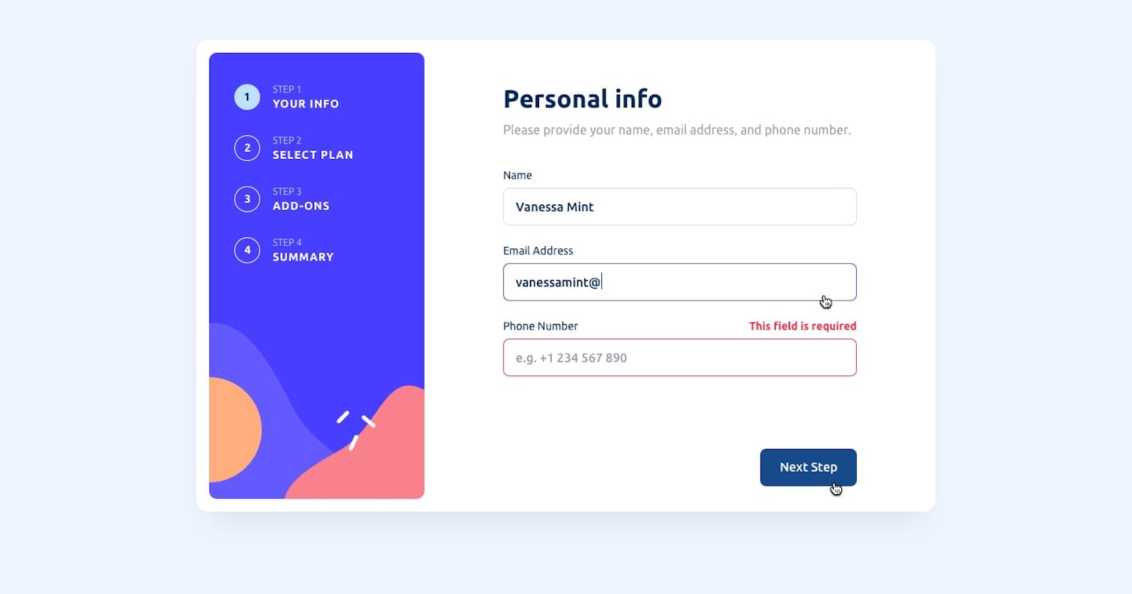
<header>
    <div class="heading">
        Personal info
    </div>
    <div class="paragraph">
        Please provide your name, email<br>
        address, and phone number.
    </div>
</header>
                <div class="step3 step">
                    <header>
                        <div class="heading">
                            Add-ons
                        </div>
                        <div class="paragraph">
                            You can select any add-ons you'd<br>
                            like to include in your plan.
                        </div>
                    </header>
                    <div class="step-hero">
                        <fieldset>
                            <img src="./images/icon-remote.svg" alt="">
                            <div class="addon-name">Remote control</div>
                            <div class="addon-description">Control your                  devices with ease. $5/mo</div>
                            <input type="checkbox" name="remote-control"     class="checkbox">
                        </fieldset>
                        <fieldset>
                            <img src="./images/icon-deal.svg" alt="">
                            <div class="addon-name">Special deal</div>
                            <div class="addon-description">Get a 50% discount on your first 3 months. $2/mo</div>
                            <input type="checkbox" name="special-deal" class="checkbox">
                        </fieldset>
                        <fieldset>
                            <img src="./images/icon-tv.svg" alt="">
                            <div class="addon-name">TV package</div>
                            <div class="addon-description">Access hundreds of channels. $15/mo</div>
                            <input type="checkbox" name="tv-package" class="checkbox">
                        </fieldset>
                    </div>
                    <div class="controls">
                        <div class="prev">Previous step</div>
                        <div class="next">Next step</div>
                    </div>
                </div>
                <div class="step4 step">
                    <header>
                        <div class="heading">
                            Summary
                        </div>
                        <div class="paragraph">
                            Here's a summary of the plan you've<br>
                            selected and the add-ons you've chosen.
                        </div>
                    </header>
                    <div class="step-hero">
                        <div class="selection-summary">
                            <div class="plan-name-summary"></div>
                            <div class="plan-duration-summary"></div>
                            <div class="add-ons-summary"></div>
                        </div>
                    </div>
                    <div class="controls">
                        <div class="prev">Previous step</div>
                        <div class="next">Complete purchase</div>
                    </div>
                </div>
            </div>
        </div>
    </main>
</form>
<Explaining form step1 />
The first part of the code is the header which gives some context to the user about what they need to provide. It has two parts: the "heading" and "paragraph". The heading tells the user what type of information is required and the paragraph provides additional details.
📝 The second part of the code is the actual form. It has three sections for the user to fill in their "Name", "Email Address", and "Phone Number". Each section has a "label" which tells the user what they need to input and an "input" field which is where they can input their information.
❌ If the user inputs incorrect information, there is a place for an "error" message to appear next to the input field. This is indicated by the "div" with a class of "error" and an ID that matches the type of input (name-error, email-error, and phone-error).
👉 Finally, there is a "next" button that the user can click once they have filled in their information. This button takes them to the next step in the form.
Also read the code snippest below to understand it more
<div class="step1 step active"> <!-- A div representing the first step of a multi-step form. -->
    <header> <!-- A header section containing a heading and a paragraph describing the step. -->
        <div class="heading">Personal info</div> <!-- A heading indicating the purpose of the step. -->
        <div class="paragraph">Please provide your name, email<br>address, and phone number.</div> <!-- A paragraph providing instructions on what the user needs to do. -->
    </header>
    <div class="step-hero"> <!-- A div containing the form fields for the step. -->
        <fieldset> <!-- A fieldset representing a group of related form fields. -->
            <div class="label-error"> <!-- A div containing the label for the input and an error message that can be displayed if needed. -->
                <label for="name">Name</label> <!-- A label indicating the purpose of the input field below. -->
                <div class="error" id="name-error"></div> <!-- An empty div that will be used to display an error message if the input is invalid. -->
            </div>
            <input type="text" id="name" placeholder="e.g. Stephen King" required> <!-- An input field where the user can enter their name. -->
        </fieldset>
        <fieldset>
            <div class="label-error">
                <label for="email">Email Address</label>
                <div class="error" id="email-error"></div>
            </div>
            <input type="text" id="email" placeholder="e.g. stephenking@lorem.com" required> <!-- An input field where the user can enter their email address. -->
        </fieldset>
        <fieldset>
            <div class="label-error">
                <label for="phone">Phone Number</label>
                <div class="error" id="phone-error"></div>
            </div>
            <input type="tel" id="phone" placeholder="e.g. +1 234 567 890" required> <!-- An input field where the user can enter their phone number. -->
        </fieldset>
    </div>
    <div class="controls"> <!-- A div containing the controls for the step. -->
        <div class="next">Next step</div> <!-- A button that the user can click to go to the next step of the form. -->
    </div>
</div>
<Explaining form step2 />
So, here we have some HTML code for the second step of a signup form, which asks the user to select a plan.
👨🔬 We have a header with a title and a brief description of the step.
👨💼 Then, we have a section where the user can select their plan. Each plan has an icon, a name, a duration, and a radio button to select it.
🕹️ We can see the plans being called "Arcade", "Advance", and "Pro" and their respective monthly fees.
🎚️ The user also has the option to toggle between monthly and yearly billing.
🏃 Lastly, there are buttons to go back or proceed to the next step.
<div class="step2 step">
  <!-- Header section with title and description -->
  <header>
    <div class="heading">
      Select your plan
    </div>
    <div class="paragraph">
      You have the option of monthly or yearly billing.
    </div>
  </header>

  <!-- Plan selection section -->
  <div class="step-hero">
    <!-- Plan 1 -->
    <fieldset for="arcade-radio">
      <img src="./images/icon-arcade.svg" alt="">
      <div class="plan-details">
        <div class="plan-name">Arcade</div>
        <div class="plan-duration" id="arcade-duration">$9/mo</div>
        <div class="free-month"></div>
        <input type="radio" value="Arcade" name="radio" id="arcade-radio" class="radios">
      </div>
    </fieldset>

    <!-- Plan 2 -->
    <fieldset for="advance-radio">
      <img src="./images/icon-advanced.svg" alt="">
      <div class="plan-details">
        <div class="plan-name">Advance</div>
        <div class="plan-duration" id="advance-duration">$12/mo</div>
        <div class="free-month"></div>
        <input type="radio" value="Advance" name="radio" id="advance-radio" class="radios">
      </div>
    </fieldset>

    <!-- Plan 3 -->
    <fieldset for="pro-radio">
      <img src="./images/icon-pro.svg" alt="">
      <div class="plan-details">
        <div class="plan-name">Pro</div>
        <div class="plan-duration" id="pro-duration">$15/mo</div>
        <div class="free-month"></div>
        <input type="radio" value="Pro" name="radio" id="pro-radio" class="radios">
      </div>
    </fieldset>
  </div>

  <!-- Billing period selection -->
  <div class="periodity">
    <span class="monthly">Monthly</span>
    <div class="toggle-switch">
      <input type="checkbox" id="switch" />
      <label for="switch">Toggle</label>
    </div>
    <span class="yearly">Yearly</span>
  </div>

  <!-- Control buttons -->
  <div class="controls">
    <div class="back">Go back</div>
    <div class="next">Next step</div>
  </div>
</div>
👋 Welcome back! This code represents the second step of our form, where users get to select their preferred plan.
🤔 Users have two billing options to choose from: monthly or yearly.
🔥 To make things more visually appealing, we've included icons for each plan: Arcade, Advance, and Pro.
🎁 Users can also enjoy a free month, but we're not saying which plan(s) get that benefit - they'll have to select a plan to find out! 😜
💰 Each plan has its own pricing - $9/mo for Arcade, $12/mo for Advance, and $15/mo for Pro. These prices are displayed in the form with the plan-duration class.
🔘 Users can toggle between monthly and yearly billing using the toggle-switch element, which is a simple checkbox input with a corresponding label.
👈 There's also a Go back button to allow users to return to the previous step, and a Next step button to proceed to the next step.
<Explaining form step3 />
Oh, let me tell you about this exciting code that I found! 🎉 It's all about enhancing the gaming experience of users through optional add-ons that they can select for their gaming subscription. 🎮
This code creates a step in a form, so users can select from three different checkboxes that contain a fieldset with a title, a short description, and a price per month for each add-on. 😎 When the user selects an add-on, the price is added to the total monthly cost of the subscription.
<!-- Step 3: Pick add-ons -->
<div class="step3 step">
    <header>
        <!-- Step heading -->
        <div class="heading">
            Pick add-ons
        </div>
        <!-- Step paragraph -->
        <div class="paragraph">
            Add-ons help enhance your gaming<br>
            experience.
        </div>
    </header>
    <div class="step-hero">
        <!-- Checkbox input for online service add-on -->
        <fieldset>
            <input type="checkbox" class="checkz" name="" id="" value="Online service">
            <!-- Service name and description -->
            <div class="service-details">
                <div class="service-name">Online service</div>
                <div class="service-description">Access to multiplayer games</div>
            </div>
            <!-- Service price -->
            <div class="servicePrice servicePrice1">+$1/mo</div>
        </fieldset>
        <!-- Checkbox input for larger storage add-on -->
        <fieldset>
            <input type="checkbox" class="checkz" name="" id="" value="Larger storage">
            <!-- Service name and description -->
            <div class="service-details">
                <div class="service-name">Larger storage</div>
                <div class="service-description">Extra 1TB of cloud save</div>
            </div>
            <!-- Service price -->
            <div class="servicePrice servicePrice2">+$2/mo</div>
        </fieldset>
        <!-- Checkbox input for customizable profile add-on -->
        <fieldset>
            <input type="checkbox" class="checkz" name="" id="" value="Customizable profile">
            <!-- Service name and description -->
            <div class="service-details">
                <div class="service-name">Customizable profile</div>
                <div class="service-description">Custom theme on your profile</div>
            </div>
            <!-- Service price -->
            <div class="servicePrice servicePrice3">+$2/mo</div>
        </fieldset>
    </div>
    <div class="controls">
        <!-- Back button -->
        <div class="back">Go back</div>
        <!-- Next button -->
        <div class="next">Next step</div>
    </div>
</div>
You can also check below for a little more explanation
Let's break it down:
The first few lines create a new div with the class "step3" and "step". This is where the "Add-ons" section will go.
Inside that div, there's a header with a "heading" and "paragraph" that explains the purpose of the section.
Then, there's a "step-hero" div that contains three "fieldset" elements. Each fieldset is a separate add-on that the user can choose to add to their subscription.
Inside each fieldset, there's an "input" element of type "checkbox" with the class "checkz". This is the actual checkbox that the user will click on to select the add-on.
After the checkbox, there's a "service-details" div that contains the name and description of the add-on.
Finally, there's a "servicePrice" div with a class (servicePrice1, servicePrice2, or servicePrice3) that indicates the cost of the add-on.
👉 The "controls" div at the bottom of the section has a "back" and "next" button that the user can use to navigate back to the previous step or go to the next step.
<Explaning form step4 />
So, imagine you're filling out a form and you've made it to the final step - woohoo! 🙌 This section of the form is all about double-checking your selections before hitting that "confirm" button.
The <div class="step4 step"> element is like a little container that holds everything for this step. It's like a little house for all the other elements to hang out in. 🏠
Inside the <div class="step4 step">, you'll find a <header> element. This is like the welcome mat for your little house. It has a heading that says "Finishing up" and a paragraph that says "Double-check everything looks OK before confirming." So polite! 🤵
Now, onto the main event - the <div class="step-hero">. This is where you'll find the "checkout" section and the "total" section. Think of it like a cashier's counter at a store. 💰
The "checkout" section is where you'll see all the stuff you've selected so far. This is broken down into different sections with names like "selectedPlan" and "selectedservice1". It's like the cashier is holding up each item and saying "You got this, this, and this - is that correct?" 🛍️
In between the "checkout" section and the "total" section, you'll see a horizontal line that acts like a divider. It's like a little rope that separates the stuff you've selected from the grand total. 🧵
Finally, the "total" section is where you'll see the final price for everything you've selected. It's like the cashier is telling you "Okay, your total comes to $$$ - are you ready to confirm?" 💸
And of course, there are the trusty "Go back" and "confirm" buttons to help you navigate this final step. It's like a little send-off from the cashier as you exit the store. 👋
<!-- Container for the final step of the form -->
<div class="step4 step">

    <!-- Heading and paragraph providing information to the user -->
    <header>
        <div class="heading">
            Finishing up
        </div>
        <div class="paragraph">
            Double-check everything looks OK<br>
            before confirming
        </div>
    </header>

    <!-- Main content of this step, including a checkout section and a total section -->
    <div class="step-hero">

        <!-- Section containing the selected plan and services that the user has chosen -->
        <div class="checkout">
            <div class="selectedPlan">
                <div class="selectedPlanName"><span class="name"></span><span class="selectedPlandurarion"></span></div>
                <div class="selectedPlanPrice"></span></div>
            </div>

            <!-- Horizontal line to visually separate the selected plan and services from the total section -->
            <hr>

            <!-- Sections for the selected services, labeled with class names -->
            <div class="selectedServices">
                <div class="selectedservice1">
                    <div class="selectedServiceName1"></div>
                    <div class="selectedServicePrice1"></div>
                </div>
                <div class="selectedservice2">
                    <div class="selectedServiceName2"></div>
                    <div class="selectedServicePrice2"></div>
                </div>
                <div class="selectedservice3">
                    <div class="selectedServiceName3"></div>
                    <div class="selectedServicePrice3"></div>
                </div>
            </div>
        </div>

        <!-- Section containing the total price of the selected plan and services -->
        <div class="total">
            <div class="selectedTotalName"><span class="name">Total</span><span class="totalSelectedPlanDurarion">(per Monthly)</span></div>
            <div class="selectedTotalPrice"><span class="plus">+</span><span class="dolla">$</span><span class="totalSelectedPrice"></span><span class="per">/</span><span class="totalPriceDuration">mon</span></div>
        </div>

        <!-- Navigation buttons for this step -->
        <div class="controls">
            <div class="back">Go back</div>
            <button class="next" type="submit">confirm</button>
        </div>
    </div>
</div>
<Finish page for the form/>
This is just a thank you for completing the form page
                <div class="finish step">
                    <img src="./images/icon-thank-you.svg" alt="">
                    <div class="thank-you-message">
                        <div class="heading">Thank you</div>
                        <div class="paragraph">
                            Thanks for confirming your subscription!<br>
                            We hope you have fun using our<br>
                            platform. if you ever need support,<br>
                            please feel free to email us at<br>
                            support@lorem.com.
                        </div>
                    </div>
                </div>
We've finally arrived at the end of our coding journey with HTML. But fear not, for the adventure is far from over! We're about to embark on a whole new level of web design: CSS!
But before we set sail on this new adventure, let's take a moment to look back on all that we've accomplished with our HTML code. We've created a dynamic and functional form that will knock the socks off anyone who uses it!
Now, as we venture forth into the wonderful world of CSS, get ready to see your code come alive with color, design, and style. So buckle up and get ready to let your creativity flow, because the sky's the limit when it comes to CSS!
<CSS Section />
* {
  margin: 0;
  padding: 0;
  box-sizing: border-box;
}

:root {
  --marine-blue: hsl(213, 96%, 18%);
  --purplish-blue: hsl(243, 100%, 62%);
  --pastel-blue: hsl(228, 100%, 84%);
  --light-blue: hsl(206, 94%, 87%);
  --strawberry-red: hsl(354, 84%, 57%);
  --cool-gray: hsl(231, 11%, 63%);
  --light-gray: hsl(229, 24%, 87%);
  --magnolia: hsl(217, 100%, 97%);
  --alabaster: hsl(231, 100%, 99%);
  --white: hsl(0, 0%, 100%);
}

@media (min-width: 357px) {
  .image .desktop {
    display: none;
  }
  body {
    height: 100vh;
  }
  form {
    height: 100%;
    width: 100%;
    display: flex;
    justify-content: center;
    align-items: center;
  }
  main {
    background-color: var(--light-blue);
    height: 50rem;
    max-width: 30rem;
    display: flex;
    flex-direction: column;
    justify-content: space-between;
  }
  main .image {
    height: 30%;
    position: relative;
  }
  main .image .step_selectors {
    position: absolute;
    top: 3em;
    left: 2.5em;
  }
  main .image .step_selectors .select.active {
    color: black;
    background-color: var(--pastel-blue);
  }
  main .image .step_selectors ul {
    display: flex;
    gap: 2rem;
  }
  main .image .step_selectors ul .step-description {
    display: none;
  }
  main .image .step_selectors li {
    list-style: none;
    font-size: 1.7rem;
    border: 1px solid white;
    border-radius: 50%;
    padding: 0.5rem;
    width: 3.7rem;
    text-align: center;
    color: white;
  }
  main .image .mobile {
    max-height: 100%;
    max-width: 370px;
  }
  main .hero {
    width: 100%;
    min-height: 100%;
    position: relative;
    background-color: var(--light-blue);
  }
  main .hero .step-container {
    width: 90%;
    background-color: white;
    height: auto;
    position: absolute;
    top: -3.7em;
    left: 1.3em;
    border-radius: 1.2rem;
    box-shadow: 0px 0px 0px 0px rgba(97, 97, 97, 0.467);
  }
🎨🖌️🎨 This is a block of CSS code that styles a webpage. It sets some global styles and defines specific styles for different elements, like 🌊🔵 colors and 📏 dimensions, to create a responsive design.
👉 The * selector sets the margin and padding of all elements on the webpage to 0, and box-sizing: border-box ensures that padding and border values are included in the element's total width and height.
💡 The :root pseudo-class defines custom 🎨 color variables using the HSL color model.
📏 The @media rule defines styles for a specific screen width or device. In this case, it applies to screen widths greater than or equal to 357 pixels.
👉 There are several class and element selectors used to style various elements on the webpage, such as body, form, main, ul, li, and select.
👀 Some of the specific styles defined include height, width, background-color, position, top, left, border, border-radius, box-shadow, font-size, color, padding, and display.
🎨 Overall, this code is part of a larger project to create a responsive web design with specific styles for different screen sizes and devices.
main .hero .step-container .step1 {
    padding: 1.3rem;
    display: flex;
    flex-direction: column;
    gap: 1em;
    position: relative;
    display: none;
  }
  main .hero .step-container .step1 header {
    display: flex;
    flex-direction: column;
    gap: 0.5em;
  }
  main .hero .step-container .step1 header .heading {
    font-size: 2.7rem;
    color: var(--marine-blue);
  }
  main .hero .step-container .step1 header .paragraph {
    font-size: 1.5rem;
    line-height: 2rem;
    color: var(--cool-gray);
  }
  main .hero .step-container .step1 .step-hero {
    display: flex;
    flex-direction: column;
    gap: 1em;
  }
  main .hero .step-container .step1 .step-hero fieldset {
    border: none;
  }
  main .hero .step-container .step1 .step-hero fieldset .label-error {
    display: flex;
    justify-content: space-between;
  }
  main .hero .step-container .step1 .step-hero fieldset .label-error label {
    color: var(--marine-blue);
    font-size: 1.3rem;
  }
  main .hero .step-container .step1 .step-hero fieldset .label-error .error {
    color: red;
  }
  main .hero .step-container .step1 .step-hero fieldset input {
    width: 100%;
    height: 5em;
    border: 1px solid var(--light-gray);
    border-radius: 0.2rem;
  }
  main .hero .step-container .step1 .step-hero fieldset ::-moz-placeholder {
    padding-left: 0.6rem;
  }
  main .hero .step-container .step1 .step-hero fieldset ::placeholder {
    padding-left: 0.6rem;
  }
  main .hero .step-container .step1 .controls {
    display: flex;
    width: 100%;
    flex-direction: column;
    align-items: end;
    position: absolute;
    bottom: -6rem;
    right: 0.5rem;
  }
  main .hero .step-container .step1 .controls .next {
    width: 5em;
    border-radius: 0.5rem;
    background-color: var(--marine-blue);
    font-size: 1.7rem;
    padding: 1rem 0.8rem;
    color: var(--white);
    cursor: pointer;
  }
  main .hero .step-container .step1.active {
    padding: 1.3rem;
    display: flex;
    flex-direction: column;
    gap: 1em;
    position: relative;
  }
  main .hero .step-container .step1.active header {
    display: flex;
    flex-direction: column;
    gap: 0.5em;
  }
  main .hero .step-container .step1.active header .heading {
    font-size: 2.7rem;
    color: var(--marine-blue);
  }
  main .hero .step-container .step1.active header .paragraph {
    font-size: 1.5rem;
    line-height: 2rem;
    color: var(--cool-gray);
  }
We have a main element with a class "hero" that contains a div with a class "step-container" and a child div with a class "step1". This "step1" div is hidden as its display property is set to none.
Inside the "step1" div, we have a header element with a child div having a class "heading" and another child div having a class "paragraph".
Then, there's a div with a class "step-hero" that contains a fieldset with an input element and a label element with a class "label-error". The label and error message are displayed side by side as the "label-error" class has a property "justify-content: space-between".
There are additional CSS properties for input field width, height, border, and border-radius.
Further down, there is a "controls" div that is positioned at the bottom right corner of the "step1" div using position:absolute property. The "next" button in this div has a blue background color, white text color, and a cursor property that changes the pointer to a hand.
Finally, there are properties for the active state of the "step1" div, which includes a padding, flex-direction, gap, and position. The header and paragraph have the same styles as before.
in lame manlanguage --- Imagine you're a fashion designer creating a new outfit for your website's hero section. You've got a bunch of different steps to follow, and each one has its own unique style.
First, you need to give your outfit some padding so it's nice and comfy. Then, you'll use some flexible fabric and arrange it in a vertical column with gaps between each section. You want it to look good from all angles, so you'll add a little positioning magic to make it relative to the rest of the page.
Now it's time to add some flair! The header of your outfit needs to stand out, so you'll arrange it in a column with a little gap between each line. The heading is the main attraction, so you'll make it big and bold with a stylish marine-blue color. The paragraph underneath will be a little smaller, but still legible with a cool gray color.
Next up is the hero section. You want to make sure it really shines, so you'll give it a flexible column with some gaps to make it pop. The fieldset is the real star here, so you'll remove its border to really make it stand out.
For the label-error section, you'll add a little space in between the label and the error message with some justified alignment. The label itself will be a stylish marine-blue, while the error message will be a bold red to really catch the eye.
Finally, you'll add some controls to the bottom of the outfit, with a little space to move around in. You'll put it in a column and align it to the right for some added flair. The "next" button will be a stylish marine-blue with a nice white font, and a little padding for comfort.
And voila! Your outfit is complete and ready to dazzle on the runway of the internet!
 main .hero .step-container .step1.active .step-hero {
    display: flex;
    flex-direction: column;
    gap: 1em;
  }
  main .hero .step-container .step1.active .step-hero fieldset {
    border: none;
  }
  main .hero .step-container .step1.active .step-hero fieldset .label-error {
    display: flex;
    justify-content: space-between;
  }
  main .hero .step-container .step1.active .step-hero fieldset .label-error label {
    color: var(--marine-blue);
    font-size: 1.3rem;
  }
  main .hero .step-container .step1.active .step-hero fieldset input {
    width: 100%;
    height: 5em;
    border: 1px solid var(--light-gray);
    border-radius: 0.2rem;
  }
  main .hero .step-container .step1.active .step-hero fieldset ::-moz-placeholder {
    padding-left: 0.6rem;
  }
  main .hero .step-container .step1.active .step-hero fieldset ::placeholder {
    padding-left: 0.6rem;
  }
  main .hero .step-container .step1.active .controls {
    display: flex;
    width: 100%;
    flex-direction: column;
    align-items: end;
    position: absolute;
    bottom: -6rem;
    right: 0.5rem;
  }
  main .hero .step-container .step1.active .controls .next {
    width: 5em;
    border-radius: 0.5rem;
    background-color: var(--marine-blue);
    font-size: 1.7rem;
    padding: 1rem 0.8rem;
    color: var(--white);
    cursor: pointer;
  }
  main .hero .step-container .step2 {
    padding: 1.3rem;
    display: flex;
    flex-direction: column;
    gap: 1em;
    position: relative;
    display: none;
  }
  main .hero .step-container .step2 header {
    display: flex;
    flex-direction: column;
    gap: 0.5em;
  }
  main .hero .step-container .step2 header .heading {
    font-size: 2.7rem;
    color: var(--marine-blue);
  }
  main .hero .step-container .step2 header .paragraph {
    font-size: 1.5rem;
    line-height: 2rem;
    color: var(--cool-gray);
  }
  main .hero .step-container .step2 .step-hero {
    display: flex;
    flex-direction: column;
    gap: 1em;
  }
  main .hero .step-container .step2 .step-hero fieldset {
    display: flex;
    border: none;
    gap: 1em;
    padding: 1em;
    border-radius: 0.5rem;
    position: relative;
  }
  main .hero .step-container .step2 .step-hero fieldset .plan-details input[type=radio]::before {
    content: "";
    position: absolute;
    background-color: transparent;
    border-radius: 0.5rem;
    top: 0em;
    bottom: 0em;
    left: 0;
    right: 0;
    opacity: 0.3;
    border: 2px solid black;
  }
  main .hero .step-container .step2 .step-hero fieldset .plan-details input[type=radio]:checked::after {
    content: "";
    position: absolute;
    background-color: rgba(249, 250, 253, 0);
    border-radius: 0.5rem;
    top: 0em;
    bottom: 0em;
    left: 0;
    right: 0;
    opacity: 1;
    border: 2px solid var(--light-blue);
  }
One for the first step of a form 👉🏼One for the second step 👉🏼The first section contains rules for active step 1, including: 💬The step hero container should be a flex container with a column direction and a gap of 1em between its child elements. 💬The fieldset element should have no border, and its label-error child element should be a flex container with space-between justification. 💬The label element's color and font size are set, and the input element's width, height, border, and border-radius properties are set. 💬Padding-left is set for the ::-moz-placeholder and ::placeholder pseudo-elements. 💬The controls element, which is a container for the "Next" button, is positioned and styled.
👉🏼The second section contains rules for step 2, including: 💬The step hero container should be a flex container with a column direction and a gap of 1em between its child elements. 💬The padding, display, and position properties are set for the step2 container, as well as the display, flex-direction, and gap properties for its header and step-hero child elements. 💬The font size and color for the heading and paragraph elements in the header are set, and the display, border, gap, padding, and border-radius properties for the fieldset element in the step-hero container are set. 💬The position and styling for the radio button inputs in the plan-details child element of the fieldset are specified.
in lame man language -- So, imagine you're a hero on a mission to save the day, and you have to navigate through a few steps to reach your goal. That's where this code comes in handy!
First off, we have our hero's step container, which contains a step one hero. This hero is active, which means they're ready to go and waiting for your command. The step one hero is flexing their column, showing off their impressive flexibility, and they're also keeping a gap of 1em between their parts.
Now, the step one hero is trying to communicate something important, so they've got a fieldset to organize their message. To make sure this message is loud and clear, the fieldset has no borders, and any label with an error is displayed with a nice, friendly space between them.
The labels themselves are pretty cool - they're colored in marine-blue, and the font size is a whopping 1.3rem. That's pretty big, right?
Next up, we have the hero's input, which is as wide as it can be, and is standing tall at 5em. It's got a border, of course, but it's a friendly one, colored in light-gray and with a cute little border-radius of 0.2rem.
The placeholder text in the input field is also pretty cool. In Firefox, it's got a padding of 0.6rem to the left, and in any other browser, it's got the same padding. Nice and consistent!
Now, the hero needs some controls to navigate through their steps. The controls are displayed in a column, aligned to the end, and positioned just right at the bottom, with the right amount of spacing. The next button is a perfect size - 5em - and has a nice border-radius of 0.5rem. It's colored in marine-blue, which is totally the hero's color, and the font size is a whopping 1.7rem. It's easy to click, too - just point and click with your cursor!
But wait, there's more! The hero has another step, step two, which is hidden for now. Step two has a header, which is a flex column with a cool heading font-size of 2.7rem, and a paragraph with a font-size of 1.5rem. The color scheme is pretty cool, with marine-blue and cool-gray.
Step two also has a step-hero, which is just like the step-one hero, except it has a few more details. The fieldset in step two is fancier - it's got some padding and a border-radius of 0.5rem, and even has some cool radio buttons. The radio buttons have a neat effect when they're checked, with a nice light-blue border.
So, that's our CSS code! The hero is ready to save the day, with their fancy steps and controls. It's all about the details, and this code has definitely got them covered!
You can check out my my github: https://github.com/MARVELGARR/Multi-step-form for the full css code
<Javascript>
// This code declares four constant variables using the "querySelectorAll" method to select all elements with the specified class names and stores them in an array-like NodeList.

const nexts = document.querySelectorAll(".next"); // selects all elements with the "next" class
const steps = document.querySelectorAll(".step"); // selects all elements with the "step" class
const selector = document.querySelectorAll(".select"); // selects all elements with the "select" class
const backs = document.querySelectorAll(".back"); // selects all elements with the "back" class

// Two let variables are declared, "stepCount" and "selectorCount", and they are both initially set to 0 and 1, respectively.
let stepCount = 0;
let selectorCount = 1;

// A variable "currentStep" is declared but not assigned a value yet.
let currentStep;

// A function "removeSelectors()" is declared, which loops through the "selector" NodeList and removes the "active" class from each element.
function removeSelectors(){
    selector.forEach(select =>{
        select.classList.remove("active");
    })
}

// A function "decrementSelector()" is declared, which calls "removeSelectors()", decrements "selectorCount", adds the "active" class to the "select" element at the current "stepCount" index, and updates the "selectorCount".
function decrementSelector(){
    removeSelectors();
    selectorCount--;
    let select = selector[stepCount];
    select.classList.add("active");
}

// A function "incrementSelector()" is declared, which calls "removeSelectors()", adds the "active" class to the "select" element at the current "selectorCount" index, and updates the "selectorCount".
function incrementSelector(){
    removeSelectors();
    let select = selector[selectorCount];
    select.classList.add("active");
    selectorCount++;
}

// A function "removeStep()" is declared, which loops through the "steps" NodeList and removes the "active" class from each element.
function removeStep(){
    steps.forEach(step =>{
        step.classList.remove("active");
    })
}
Hello, welcome to the code explanation! 🤖
📝 So, this code has a bunch of constants and variables that select elements from the DOM based on their class names. It's like picking your favorite toy from a shelf, but with code. 😜
🔍 First, we have a bunch of elements that are selected and stored in a NodeList. We're talking about the "next", "step", "select", and "back" classes. All of these elements are like a group of friends that we can access anytime we want. 🕵️♀️
🔢 We also have two variables called "stepCount" and "selectorCount", which sound like characters from a mathematical adventure movie. They both start at 0 and 1, respectively. 🤓
🤔 There's also a variable called "currentStep", but it's not assigned any value yet. Maybe it's waiting for its turn to shine like a star in the night sky. 🌟
🎉 Next, we have three functions that do some cool stuff. First, we have "removeSelectors()", which removes the "active" class from all the elements with the "select" class. It's like taking away the spotlight from all the divas in the group. 😎
📉 Then, we have "decrementSelector()", which decreases "selectorCount" and adds the "active" class to the "select" element at the current "stepCount" index. It's like playing a game of musical chairs, but with a smaller group. 🪑
📈 Finally, we have "incrementSelector()", which increases "selectorCount" and adds the "active" class to the "select" element at the current "selectorCount" index. It's like adding more chairs to the musical chairs game and inviting more divas to the party. 🎶
🙅♀️ Oh, and we can't forget "removeStep()", which removes the "active" class from all the elements with the "step" class. It's like turning off the lights and telling everyone the party's over. 😴
// Get the elements with the given IDs
const Name = document.getElementById("name");
const email = document.getElementById("email");
const phone = document.getElementById("phone");
const nameErr = document.getElementById("name-error");
const emailErr = document.getElementById("email-error");
const phoneErr = document.getElementById("phone-error");

let $email; // Declare a variable to hold the email
let $phone; // Declare a variable to hold the phone number

function setError(error, message) {
  // Set the error message for the given element
  error.parentElement.childNodes[1].children[1].textContent = message;
}

// This section handles the form validation in step 1
function formValidation() {
  $name = Name.value.trim(); // Get the name input value and remove whitespace
  $email = email.value.trim(); // Get the email input value and remove whitespace
  $phone = phone.value.trim(); // Get the phone input value and remove whitespace
  let isValid = true; // Set the initial validity to true

  if ($name == "") { // Check if name input is empty
    setError(Name, "Please Enter your name"); // Display error message for name input
    isValid = false; // Set the validity to false
  } else {
    setError(Name, ""); // Clear the error message for name input
  }

  if ($email == "") { // Check if email input is empty
    setError(email, "Please Enter your email address"); // Display error message for email input
    isValid = false; // Set the validity to false
  } else if (!validateEmail($email)) { // Check if email is valid using the validateEmail function
    setError(email, "Please enter a valid email address"); // Display error message for email input
    isValid = false; // Set the validity to false
  } else {
    setError(email, ""); // Clear the error message for email input
  }

  if ($phone == "") { // Check if phone input is empty
    setError(phone, "Please Enter your phone number"); // Display error message for phone input
    isValid = false; // Set the validity to false
  } else if (isNaN($phone)) { // Check if phone input is not a number
    setError(phone, "Please enter a valid phone number"); // Display error message for phone input
    isValid = false; // Set the validity to false
  } else {
    setError(phone, ""); // Clear the error message for phone input
  }

  return isValid; // Return the validity of the form
}

// Function to validate email format
function validateEmail(email) {
  const emailRegex = /^[^\s@]+@[^\s@]+\.[^\s@]+$/; // Regex pattern for email validation
  return emailRegex.test(email); // Test if the given email matches the pattern
}
irst, we have a bunch of variables that grab elements from the page. They're like little minions that go out and fetch things for us! 🦾
Then, we have a couple of variables that start with a dollar sign. Are they fancy money variables? Nope! They're just regular variables with a silly name. 💰
Next, we have a function that sets error messages. It's like a little robot that writes on the page for us! 🤖
After that, we have a function that does some form validation. It checks if the user entered a name, email, and phone number, and if they did, it checks if the email and phone number are in the correct format. It's like a strict teacher checking your homework! 🧐
Finally, we have a function that validates the email format using a fancy-looking regular expression. It's like a secret code that only email addresses can decipher!
// Iterate over each "next" button
nexts.forEach(next => {
    // Set the current step to the current step count
    currentStep = steps[stepCount];
    // Add a click event listener to each "next" button
    next.addEventListener("click", ()=>{
        // If there are more steps and the form is valid
        if(stepCount < steps.length && formValidation()){
            // Remove the current step and move to the next one
            removeStep();
            stepCount++;
            currentStep = steps[stepCount];
            currentStep.classList.add("active");

            // Increment the selector to the next step
            incrementSelector();
        }
    })
})

// Add a click event listener to each "back" button
backs.forEach(back =>{
    back.addEventListener("click", () =>{
        // Remove the current step and move back to the previous one
        removeStep();
        stepCount--;
        currentStep = steps[stepCount];
        currentStep.classList.add("active");

        // Decrement the selector to the previous step
        decrementSelector();
    })
})
👉 So basically, we've got a loop going on with "nexts.forEach(next =>" which is listening for clicks on a button with the "addEventListener" method.
🤔 And what happens when a user clicks the button, you ask? Well, as long as the "stepCount" is less than the total number of "steps" and the form is validated (cause we don't want no funny business), we're gonna remove the current step, move on to the next step, and add an "active" class to show that we're on that step.
👍 Then, we'll increment the selector, because we're moving forward in the process!
👈 But wait, there's more! We also have a loop with "backs.forEach(back =>" which listens for clicks on another button.
🤔 So what happens when you click this one, you ask? Well, we're gonna remove the current step (bye-bye!), move back to the previous step, and add an "active" class to show that we're on that step instead.
👎 And because we're going backwards in the process (why would you do that?), we're gonna decrement the selector.
// Select the HTML elements containing the plan name and selected plan price
const PlanName = document.querySelector(".name");
const selectedPlanPrice = document.querySelector(".selectedPlanPrice");

// Select all the radio buttons for plans
const radios = document.querySelectorAll(".radios");

// Loop through each radio button and add a change event listener
radios.forEach(radio => {
  radio.addEventListener("change", (event) => {
    // Check if the radio button is checked
    if (radio.checked) {
      // Get the selected plan and its price
      selectedRadio = event.target.value;
      let selectedRadioPrice = event.target.parentElement.children[1].textContent;

      // Update the plan name and price in the HTML
      PlanName.textContent = selectedRadio;
      selectedPlanPrice.textContent = selectedRadioPrice;

      // Select the toggle button and add a change event listener to it
      const toggleButton = document.getElementById("switch");
      toggleButton.addEventListener("change", () => {
        // Check if the toggle button is checked
        if (toggleButton.checked) {
          // If checked, update the plan durations to yearly and their prices
          arcadeDuration.textContent = "$90/yr";
          advanceDuration.textContent = "$120/yr";
          proDuration.textContent = "$150/yr";
          selectedPlanDurarion.textContent = "(Yearly)";
          totalSelectedPlanDurarion.textContent = "(Per Yearly)";
          totalPriceDuration.textContent = "yr";
          // Update the selected plan price to its yearly price
          selectedPlanPrice.textContent = event.target.parentElement.children[1].textContent;
        } else {
          // If not checked, update the plan durations to monthly and their prices
          arcadeDuration.textContent = "$9/mo";
          advanceDuration.textContent = "$12/mo";
          proDuration.textContent = "$15/mo";
          selectedPlanDurarion.textContent = "(Monthly)";
          totalSelectedPlanDurarion.textContent = "(Per Monthly)";
          totalPriceDuration.textContent = "mo";
          // Update the selected plan price to its monthly price
          selectedPlanPrice.textContent = event.target.parentElement.children[1].textContent;
        }
      });
    } else {
      // If no plan is selected, clear the plan name
      PlanName.textContent = "";
    }
  });
});

// Select the elements containing the plan durations and their prices
const frees = document.querySelectorAll(".free-month");
const planDuration = document.querySelectorAll(".plan-duration");
const selectedPlanDurarion = document.querySelector(".selectedPlandurarion");
const arcadeDuration = document.getElementById("arcade-duration");
const advanceDuration = document.getElementById("advance-duration");
const proDuration = document.getElementById("pro-duration");
const servicePrice1 = document.querySelector(".servicePrice1");
const servicePrice2 = document.querySelector(".servicePrice2");
const servicePrice3 = document.querySelector(".servicePrice3");

// Select the default checked radio button and the total plan duration and its price elements
const defaultCheck = document.querySelector(".checkz:checked");
const totalSelectedPlanDurarion = document.querySelector(".totalSelectedPlanDurarion");
const totalPriceDuration = document.querySelector(".totalPriceDuration");

// Select the toggle button and add a change event listener to it
const toggleButton = document.getElementById("switch");
toggleButton.addEventListener("change", () => {
  // Loop through all elements containing "2 months free" and toggle their visibility
  frees.forEach(free => {
    if (free.textContent == "") {
      free.textContent = "2 months free";
    } else {
      free.textContent = "";
    }
  });

  // Check if the toggle button is checked
  if (toggleButton.checked) {
    // If checked, update the plan durations to yearly and their prices
    arcadeDuration.textContent = "$90/yr;
advanceDuration.textContent = "$120/yr";
                proDuration.textContent = "$150/yr";

                selectedPlanDurarion.textContent = "(Yearly)"
                totalSelectedPlanDurarion.textContent = "(Per Yearly)"
                totalPriceDuration.textContent = "yr"
                servicePrice1.textContent = "+$10/yr";
                servicePrice2.textContent = "+$20/yr";
                servicePrice3.textContent = "+$20/yr";
            }
            else{
                arcadeDuration.textContent = "$9/mo";
                advanceDuration.textContent = "$12/mo";
                proDuration.textContent = "$15/mo";


                servicePrice1.textContent = "+$1/mo";
                servicePrice2.textContent = "+$2/mo";
                servicePrice3.textContent = "+$2/mo";
            }
})
JavaScript code that controls a radio button and toggle button with some funny service plan durations and prices!
😎 The first part of the code sets variables for some HTML elements that will be controlled later by the radio and toggle buttons.
😂 Then, the code uses a forEach loop to add event listeners to each radio button. When a radio button is changed, the event listener checks to see if the button is checked. If it is, the code grabs the name and price of the selected plan and updates the name and price shown on the page. The code also sets another event listener on the toggle button, so that if the toggle button is changed, the duration and prices for the selected plan will change too.
🤣 If a radio button is unchecked, the code just clears the name shown on the page.
😝 The second part of the code adds an event listener to the toggle button so that if it's changed, the prices and durations for each plan will change too. The code also updates some text on the page to reflect the new prices and durations. The code even adds some funny text like "2 months free" and "+$10/yr" to make it more interesting.
👍 Overall, this code is a fun and interactive way to show different service plans and prices to users.
// Get all the checkboxes with class "checkz"
const checkboxs = document.querySelectorAll(".checkz");

// Create an empty array for the selected addons
let addons = [];

// Get the name and price of the checked checkbox (if any)
let checkName = document.querySelector(".checkz:checked") ? document.querySelector(".checkz:checked").value : "";
let checkPrice = document.querySelector(".checkz:checked") ? document.querySelector(".checkz:checked").parentElement.children[2].textContent : "";

// Get the HTML elements that will display the selected service names and prices
const selectedServiceName1 = document.querySelector(".selectedServiceName1");
const selectedServiceName2 = document.querySelector(".selectedServiceName2");
const selectedServiceName3 = document.querySelector(".selectedServiceName3");
const selectedServicePrice1 = document.querySelector(".selectedServicePrice1");
const selectedServicePrice2 = document.querySelector(".selectedServicePrice2");
const selectedServicePrice3 = document.querySelector(".selectedServicePrice3");

// Initialize variables for later use
let replaced;
let totalPrice;
let addonTotal;

// Add an event listener to each checkbox
checkboxs.forEach(check =>{
    check.addEventListener("change", (event)=>{
        // If the checkbox is checked, add the addon to the addons array and update the selected service names and prices
        if(event.target.checked){
            checkName = event.target.value;
            checkPrice = event.target.parentElement.children[2].textContent;
            addons.push({name : checkName,  price : checkPrice});
            // Add an event listener to the toggle button
            toggleButton.addEventListener("change", ()=>{
                if(toggleButton.checked){
                    // If the toggle button is checked, update the prices of all the addons to the price of the checked addon
                    checkName = event.target.value;
                    checkPrice = event.target.parentElement.children[2].textContent;
                    addons.map(addon=>{
                        addon.price = checkPrice;
                        // Update the selected service names and prices based on the number of addons selected
                        if(addons.length >= 1){
                            selectedServicePrice1.textContent = addons[0].price;
                            selectedServiceName1.textContent = addons[0].name;
                        }
                        else{
                            selectedServicePrice1.textContent = "";
                            selectedServiceName1.textContent = "";
                        }
                        if(addons.length >= 2){
                            selectedServicePrice2.textContent = addons[1].price;
                            selectedServiceName2.textContent = addons[1].name;
                        }
                        else{
                            selectedServicePrice2.textContent = "";
                            selectedServiceName2.textContent = "";
                        }
                        if(addons.length >= 3){
                            selectedServicePrice3.textContent = addons[2].price;
                            selectedServiceName3.textContent = addons[2].name;
                        }
                        else{
                            selectedServicePrice3.textContent = "";
                            selectedServiceName3.textContent = "";
                        }
                    })
                }
                else{
                    // If the toggle button is not checked, update the prices of all the addons to their original prices
                    addons.map(addon=>{
                        addon.price = event.target.parentElement.children[2].textContent;
                    })
                    // Update the selected service names and prices based on the number of addons selected
                    if(addons.length >= 1){
                        selectedServicePrice1.textContent = addons[0].price;
                        selectedServiceName1.textContent = addons[0].name;
                    }
                    else{
                        selectedServicePrice1.textContent = "";
                        selectedServiceName1.textContent = "";
                    }
                    if(addons.length >= 2){
                        selectedServicePrice2.textContent = addons[1].price;
                        selectedServiceName2.textContent = addons[1].
} else {
      selectedServiceName2.textContent = "";
      selectedServicePrice2.textContent = "";
    }
    if (addons.length >= 3) {
      selectedServiceName3.textContent = addons[2].name;
      selectedServicePrice3.textContent = addons[2].price;
    } else {
      selectedServiceName3.textContent = "";
      selectedServicePrice3.textContent = "";
    }
  });
});

// Attach event listener to the toggle button
toggleButton.addEventListener("change", () => {
  let addonTotal = addons.reduce((total, addon) => {
    return total + parseFloat(addon.price.replace(/\$/g, ''));
  }, 0);
  let replaced = selectedPlanPrice.textContent.replace("$", "").replace("mo", "").replace("/", "");
  // Calculate the total price of the selected services based on the selected billing frequency
  if (toggleButton.checked) {
    totalPrice.textContent = Number(addonTotal) + Number(replaced);
  } else {
    totalPrice.textContent = Number(addonTotal) + Number(replaced);
  }
});

// Calculate the initial total price of the selected services and update the HTML element that displays it
let addons = [];
let addonTotal = addons.reduce((total, addon) => {
  return total + parseFloat(addon.price.replace(/\$/g, ''));
}, 0);
let replaced = selectedPlanPrice.textContent.replace("$", "").replace("mo", "").replace("/", "");
totalPrice.textContent = Number(addonTotal) + Number(replaced);
👨💻 The code is like a shopping assistant! It first looks for all elements with a "checkz" class, and then creates an empty array called "addons".
✨ When you check a checkbox, the code grabs the name and price of the selected service, and adds it to the "addons" array. The code also listens for changes to the checkbox's checked status, and updates the display of selected service names and prices accordingly.
🔎 The code selects various elements on the page to display the selected service name and price. It also sets up an event listener for a toggle button, which determines if you want to purchase the service monthly or yearly.
🔢 If you choose the monthly option, the code calculates the total price of the selected services and adds it to the price of the selected plan. It then displays the result. If you choose the yearly option, it does the same thing, but for a whole year.
🚫 If you uncheck a checkbox, the code removes the corresponding object from the "addons" array. The display of selected service names and prices is then updated.
🛍️ In short, the code helps you choose and buy extra services to add to your subscription plan on a website.
🎉👏🌟 Awesome job, you made it to the end of my technical writing about the multistep form! 🙌🎉
I hope you had as much fun reading it as I had creating it - because let's be real, building a multistep form with HTML, CSS, and JavaScript is like being on an adrenaline-fueled rollercoaster ride. 🎢
But don't worry, I survived the ride - and I'm pretty sure I didn't break too many things along the way. 😜
Now, if you're feeling up to the challenge, why not try creating your own multistep form? It's like solving a Rubik's Cube, but with less frustration and more satisfaction. And hey, you can even add your own emojis to make it more fun! 🤪
So go ahead, give it a shot! And who knows, maybe you'll end up creating something even more amazing than what I did. 😉